


Key Learning
Duration
1 week
Role
UX/ UI Designer
Client
The IWGIA (Case Study)
Tools
Figma
The Team
Shianthavi Suresh
Franco Bertogg Gallardo
Celyn Dizon

1 MAP
We researched IWGIA’s current site, identifying usability pain points and evaluating their donation flow using Nielsen Norman Group's usability principles. Our primary research involved user interviews with potential donors.
2 SKETCH
We brainstormed potential solutions, using Crazy 8 sketches to generate a broad range of ideas.

3 DECIDE
After reviewing user insights and prioritising user needs, we storyboarded a streamlined user journey that focused on guiding users toward quick and seamless donations.

4 PROTOTYPE
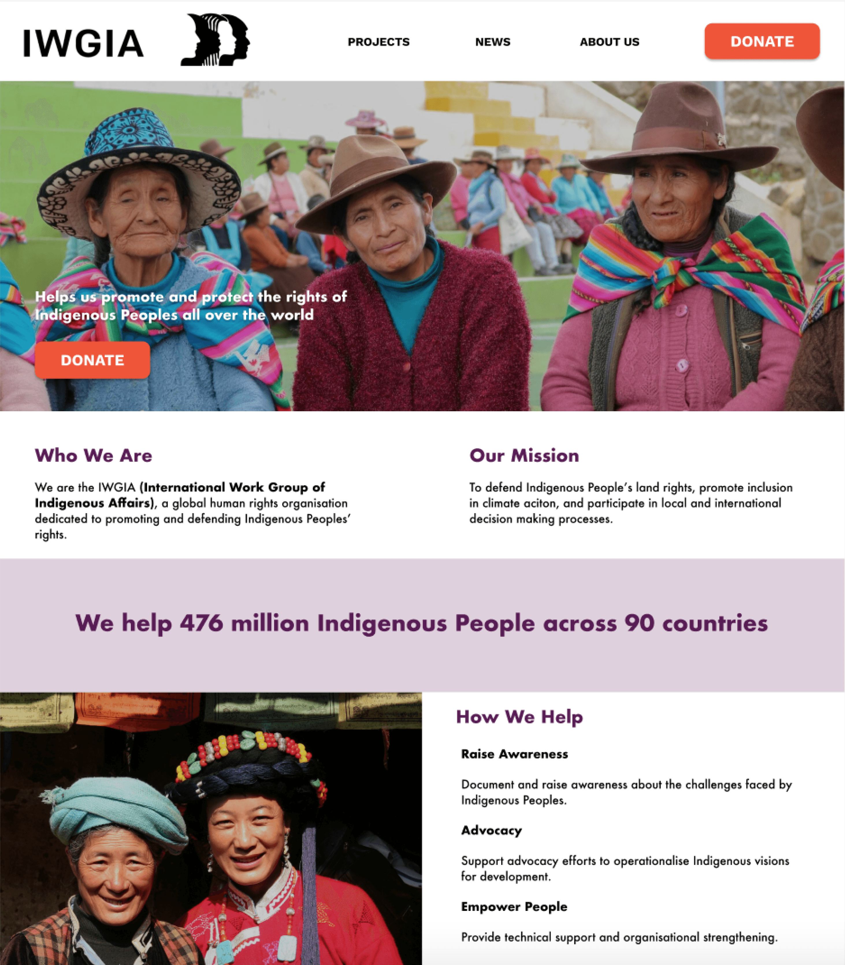
As a team, we built a prototype that simplified navigation and donation. I was responsible for designing the homepage and writing copy, while my teammates handled the icons, imagery, and donation flow wireframes.

5 TEST
We conducted usability tests to validate the effectiveness of our prototype. Feedback from users led to several iterations, including adjustments to the donation confirmation page and improved clarity around membership options. We presented our final prototype earning high praise for our work.

47%
experienced usability problems on charity websites
Cluttered pages and confusing workflows led to higher donor drop-off rates
(2023 Charity Digital Skills Report)
36%
of potential donors said they would donate more if the process was easier
“I like it when charities show figures and statistics to indicate how much money is being used”
“I value transparency, visual documentation, and achievement statistics.”
“A charity’s website needs to be authenticated, to show they are legitimate”
“It was a very smooth and seamless experience when I donated online”
“I need clear information about the charity’s mission and impact.”
“How to make a donation wasn’t clear and I had to search for it which was frustrating”


Shainthavi Suresh © 2026