Making political finance transparent and accessible

Making political finance transparent and accessible

Making political finance transparent and accessible

Overview

Consolidate is a civic tech company dedicated to aggregating and connecting political information from a wide range of sources, with the goal of fostering a well-informed and transparent democracy.


As the sole UX/UI Designer, I led a comprehensive, research-driven redesign to tackle the fragmented and inefficient state of political financial data. My mission was to transform the platform’s usability, visual design, and overall user experience, ensuring that complex information could be easily navigated and understood by all users. This case study highlights the challenges, insights, and strategic design decisions that resulted in a more intuitive, user-centered experience.

Key Outcomes

• Improved user experience and engagement

through intuitive and impactful design improvements

• Streamlined navigation and UI consistency

• Advocated for evidence-based design decisions

• Increased product value through valuable and accessible political insights

• Improved user experience and engagement

through intuitive and impactful design improvements

• Streamlined navigation and UI consistency

• Advocated for evidence-based design decisions

• Increased product value through valuable and accessible political insights

The Design Journey

The Design Journey

The Design Journey

Scope
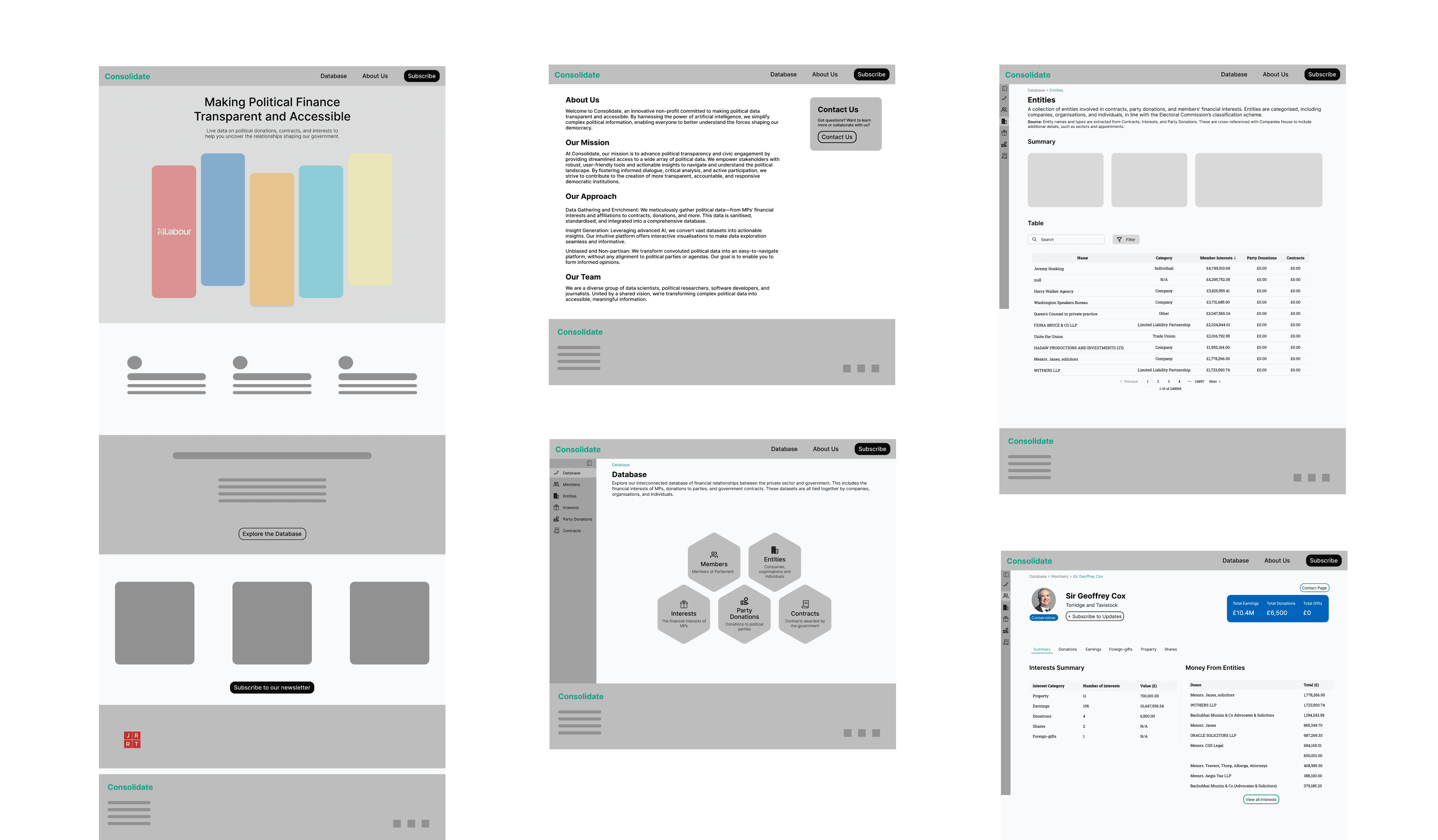
Current Platform Audit

Information Architecture

UX Research & Design

Branding

UI Design

Prototyping

User Testing

Interaction Design

Design System

Design New Features

Role
Lead Product Designer

Duration
12 weeks

Tools

Figma

Platform

Responsive Design

My Approach

I followed a user-centred, iterative design process, balancing business goals with usability. The project involved:

  1. Auditing the current experience

  2. User interviews & research

  3. Ideation & wireframing

  4. UI design & branding

  5. User testing & iteration

  6. Handoff to development


In this case study, I delve into the key challenges, solutions, and outcomes.

Discovery

Discovery

Discovery

The Problem

The Problem

The existing platform had several UX/UI challenges:

• Inconsistencies in the UI led to confusion and inefficiencies.

• Lack of user-friendly navigation made key features harder to find.

• Limited scalability & accessibility issues affected usability.

• Stakeholders were hesitant about design changes without clear data-driven reasoning.

Findings from the Current Experieince Audit

Findings from the Current Experieince Audit

I conducted a heuristic evaluation & usability review, uncovering the following:

I conducted a heuristic evaluation & usability review, uncovering the following:

Complex information architecture

Complex information architecture.

Complex information architecture

Complex information architecture.

Complex information architecture

Complex information architecture.

Inconsistent UI patterns causing friction

Inefficient user flows slowing down key actions

Navigation lacked clarity, increasing user frustration

Navigation lacked clarity, increasing user frustration.

Inefficient user flows slowing down key actions.

Inconsistent UI patterns causing friction

Inefficient user flows slowing down key actions

Navigation lacked clarity, increasing user frustration

Navigation lacked clarity, increasing user frustration.

Inefficient user flows slowing down key actions.

Inconsistent UI patterns causing friction

Inefficient user flows slowing down key actions

Navigation lacked clarity, increasing user frustration

Navigation lacked clarity, increasing user frustration.

Inefficient user flows slowing down key actions.

User Interview Insights

User Interview Insights

To understand pain points, I interviewed researchers and journalists as primary users, focusing on:

• Functionality: Are they able to find the information they require and interact with it the way they dsire?

• Task efficiency: What slows them down?

• Navigation: How intuitive is the platform?

• Accessibility: Can all users interact smoothly?

All users struggled with confusing navigation and preferred a clearer hierarchy

Terminology & UI inconsistencies caused confusion

Users highly appreciate the ability to get insights from the data

A more modern, structured design would improve adoption

Users expressed that most platforms made for researchers are not the most user-friendly

Accessibility gaps made the experience frustrating for some users

How Might We

How Might We

Refine the navigation to ensure researchers can find the data and insights they require efficiently?

Refine the navigation to ensure researchers can find the data and insights they require efficiently?

Make evidence-based design changes to improve usability and visual hierarchy?

Make evidence-based design changes to improve usability and visual hierarchy?

Create a scalable UI System that remains flexible for future updates?

Create a scalable UI System that remains flexible for future updates?

The Solution

The Solution

The Solution

After understanding the core problem, I moved on to defining the solution by identifying key opportunities for design intervention.

After understanding the core problem, I moved on to defining the solution by identifying key opportunities for design intervention.

UI Inspiration

UI Inspiration

Before jumping into design, I gathered competitive & UI inspiration from:

• Best practices in B2B SaaS platforms

• Modern dashboard & data visualisation trends

• Accessibility standards for contrast, readability, and interaction

Before jumping into design, I gathered competitive & UI inspiration from:

• Best practices in B2B SaaS platforms

• Modern dashboard & data visualisation trends

• Accessibility standards for contrast, readability, and interaction

Ideation

Ideation

With research insights in mind, I explored multiple low-fidelity sketches & wireframes, testing different layouts and structures. My focus was on:

• Improving information hierarchy for clarity by introducing a dshboard layout.

• Enhancing navigation for quicker access to key features through more functional navigation bars and breadcrumbs.

• Designing scalable UI components for future growth that are visually consistent.

Low-Fidelity Wireframes

Low-Fidelity Wireframes

I created wireframes to validate structure & flow before applying visual design. These wireframes focused on:

• A clean, full-length sidebar navigation for clarity.

• Simplified workflows to reduce cognitive load.

• Standardised UI components for consistency.

I created wireframes to validate structure & flow before applying visual design. These wireframes focused on:

• A clean, full-length sidebar navigation for clarity.

• Simplified workflows to reduce cognitive load.

• Standardised UI components for consistency.

Key Flow: All of the different databases are now in a interactive database which improves, navigation, usability and visual impact.

Key Flow: All of the different databases are now in a interactive database which improves, navigation, usability and visual impact.

Branding

Branding

I began the branding process by meeting with the client to understand their vision for the website’s look and feel, as well as the core brand values. Key attributes they emphasised included trustworthiness, approachability, a balance between professionalism and accessibility, nonpartisanship, transparency, and delivering valuable insights.


To translate these values into a cohesive visual identity, I started by creating a moodboard that captured the essence of these keywords and served as my primary source of inspiration. From this, I developed a colour palette, experimenting with different combinations until I found the perfect balance, ensuring consistency and alignment with the brand's mission across all designs.

High-Fidelity Wireframes

High-Fidelity Wireframes

Once the wireframes were validated, I applied final UI design principles to create the first iteration of the high-fidelity wireframes :

• A modern, intuitive interface that aligns with brand goals.

• Scalable design system ensuring consistency across pages.

• Enhanced visual hierarchy & interactions for usability.


Below are a few of the frames where I experimented with colour and design. These are not the final designs.

User Testing

User Testing

To validate the final design, I conducted usability tests with key users. I tested the following:

• Ease of navigation & feature discoverability

• Clarity of interface & content structure

• Efficiency of key workflows

To validate the final design, I conducted usability tests with key users. I tested the following:

• Ease of navigation & feature discoverability

• Clarity of interface & content structure

• Efficiency of key workflows

Users completed tasks faster than before

Users completed tasks faster than before

Users found navigation very easy

Users found navigation very easy

All users loved the new design and flow

All users loved the new design and flow

Users appreciated the summary stats displayed above the tables

Users appreciated the summary stats displayed above the tables

Iterations

Iterations

User testing was crucial in identifying minor yet impactful usability issues. Overall, feedback was overwhelmingly positive, with the only area for improvement being the interactive feature on the database page, where some users experienced confusion. I redesigned this element for better clarity and iterated on the design to further enhance the look and feel.

Consolidate

Consolidate

Consolidate

Navigate the World of Political Finance

Navigate the World of Political Finance

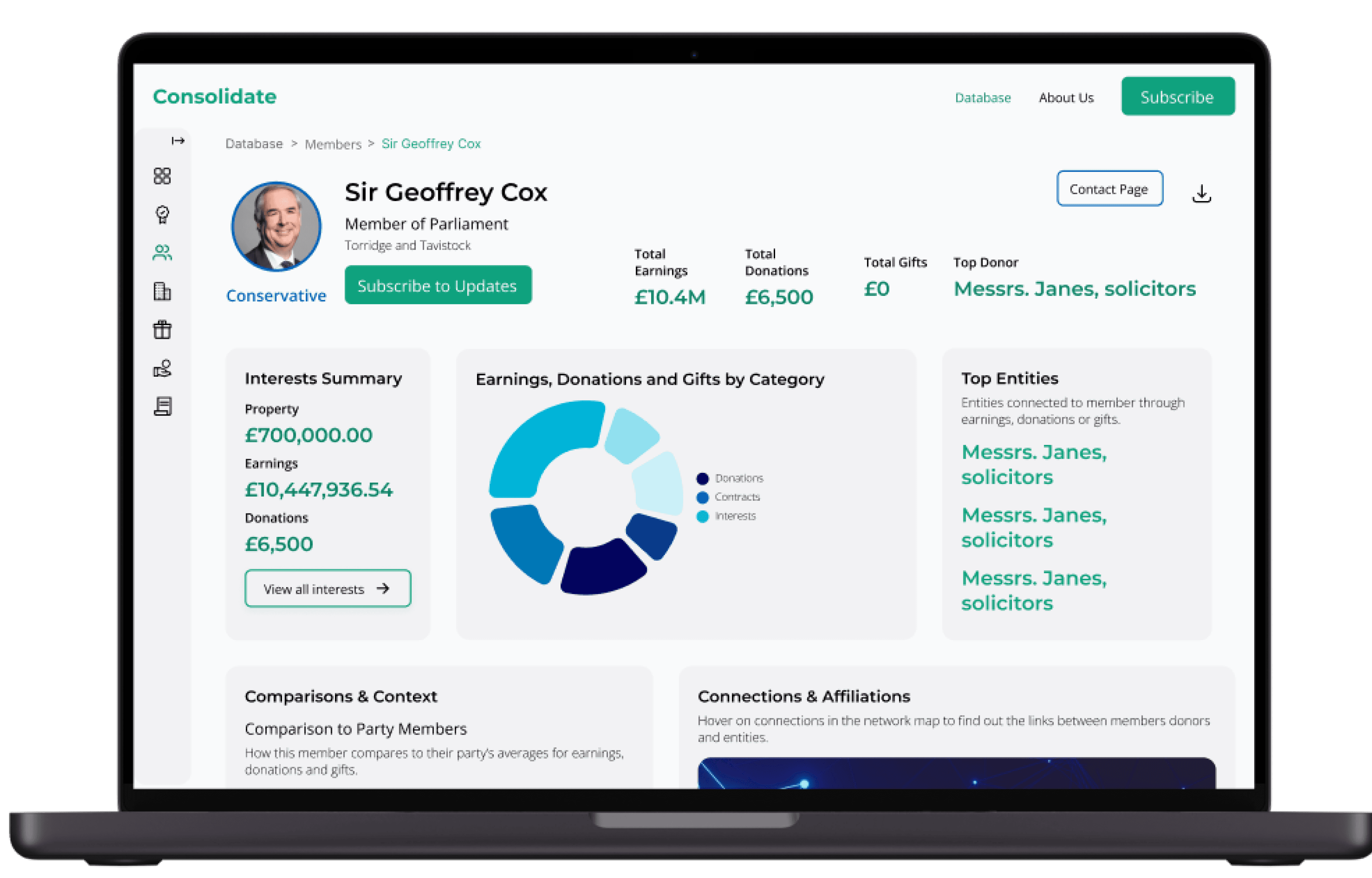
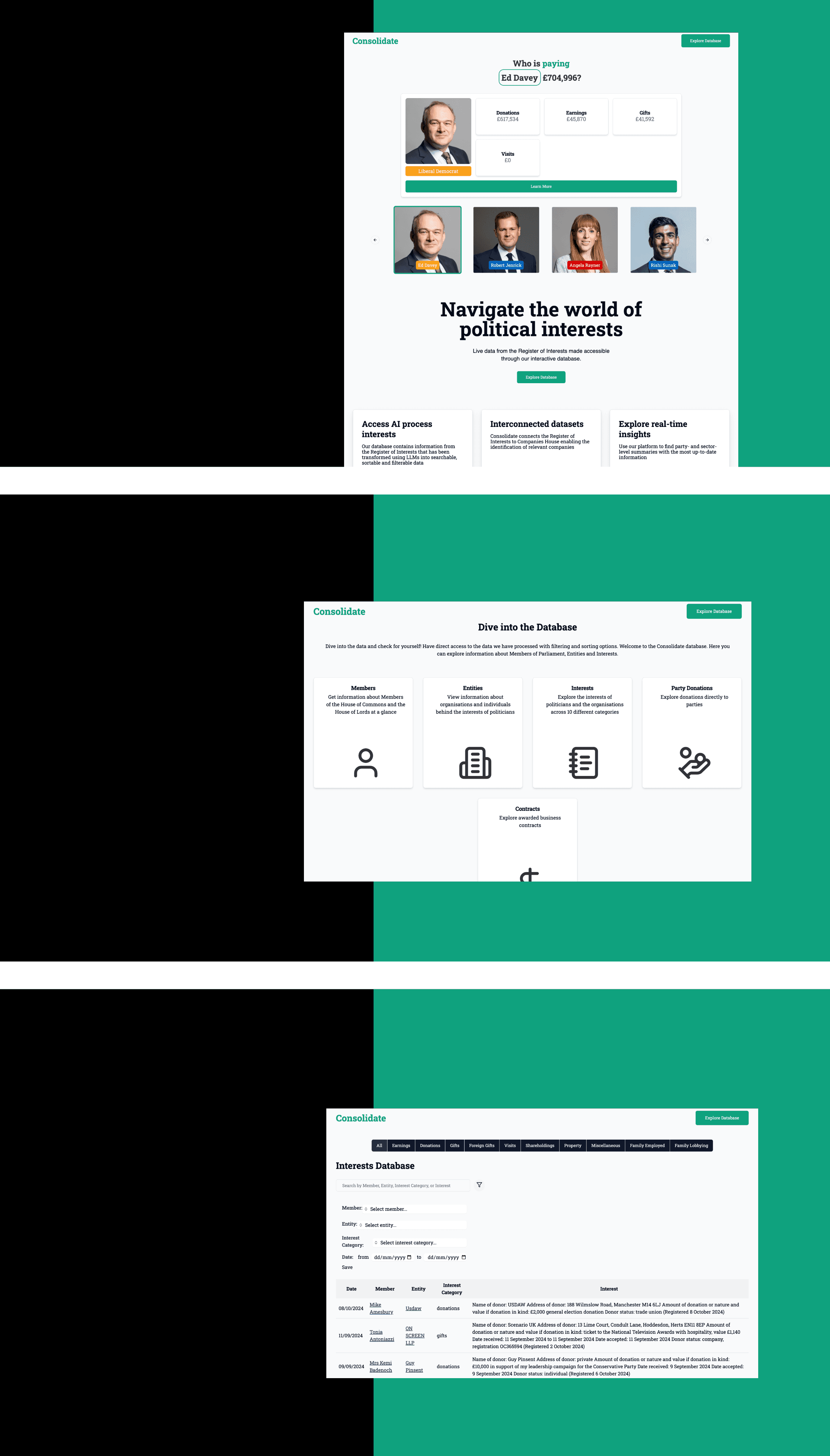
Consolidate is a cutting-edge civic tech platform that transforms fragmented political financial data into clear, valuable insights. By aggregating and connecting information from disparate sources, it empowers users to navigate complex political landscapes with ease. Designed for accessibility and transparency, Consolidate optimises usability, engagement, and data clarity, ensuring that policymakers, researchers, and citizens can make well-informed decisions.

Final Prototype

Final Prototype

The final product provides a seamless, modern, and accessible experience, balancing business needs with user expectations.

The final product provides a seamless, modern, and accessible experience, balancing business needs with user expectations.

See the final interactive prototype:

See the final interactive prototype:

Mobile View

Mobile View

UI System

UI System

Finally, I created a UI System to ensure consistency across the app. This included typography, colour schemes, and icons, making it easy to expand Consolidate into future iterations.


To refine the visual experience, I:

• Developed a consistent design system.

• Improved colour contrast & typography for accessibility.

• Created scalable UI components for future use.

Challenges

Challenges

Challenges

Stakeholder Buy-in:

Convincing business stakeholders of design changes required data-driven advocacy. I presented user research insights to justify each decision.

Balancing Business & User Needs: The challenge was to enhance usability while ensuring business goals weren’t compromised. I aligned design decisions with measurable business outcomes.

Scalability & Accessibility: Creating a scalable UI system that was future-proof and adhered to accessibility standards was a priority.

Scalability & Accessibility: Creating a scalable UI system that was future-proof and adhered to accessibility standards was a priority.

Outcomes

Outcomes

Outcomes

Overall, the client was extremely pleased with the new design. They appreciated the impactful design, the intuitive user flow and the design system that can be used the scale the business and expand more features on the platform.

Overall, the client was extremely pleased with the new design. They appreciated the impactful design, the intuitive user flow and the design system that can be used the scale the business and expand more features on the platform.

Stakeholder Engagement

Stakeholder Engagement

How I influenced decisions:

• Presented research-backed insights to drive design discussions.

• Conducted stakeholder workshops to align on priorities.

• Collaborated with cross-functional teams to ensure feasibility.

Development Handover

I ensured smooth design-to-development transition by:

• Delivering comprehensive Figma design files & documentation.

• Annotating designs for clarity on interactions & logic.

• Working closely with developers to address feasibility concerns.

Results & Impact

Results & Impact

• Improved User Experience: Increased efficiency & usability.

• Higher Engagement: More intuitive workflows.

• Stronger Design System: Scalable & future-proof UI.

• Stakeholder Alignment: Successfully advocated for UX improvements.

Key Learnings

Key Learnings

This project helped me refine my Product Design mindset, reinforcing key principles:

This project helped me refine my Product Design mindset, reinforcing key principles:

User-Centric Thinking: Always tie design decisions back to real user needs and behaviours.

Storytelling & Stakeholder Influence: Research alone isn't enough; presenting insights in a compelling way is key.

Storytelling & Stakeholder Influence: Research alone isn't enough; presenting insights in a compelling way is key.

Balancing Design & Business Needs: Design isn't just about aesthetics, it’s about creating impact.

Balancing Design & Business Needs: Design isn't just about aesthetics, it’s about creating impact.

End-to-End Product Thinking: A great designer considers how solutions scale and integrate into a product ecosystem.

End-to-End Product Thinking: A great designer considers how solutions scale and integrate into a product ecosystem.

Iterative Problem-Solving: The first solution is rarely the best. Testing, refining, and adapting is crucial.

Iterative Problem-Solving: The first solution is rarely the best. Testing, refining, and adapting is crucial.

Attention to Detail: Pixel-perfection matters, but so does the broader experience, accessibility, and usability.

Attention to Detail: Pixel-perfection matters, but so does the broader experience, accessibility, and usability.

The Future of Consolidate

The Future of Consolidate

This redesign is just the beginning. As Consolidate evolves, we aim to introduce richer data visualisations, enhanced interactivity, and expanded features to further empower users. Future updates will include:

Deeper insights & analytics: More advanced data visualisations to make political financial information clear and engaging.

Interactive exploration: Improved ways for users to interact with and navigate complex datasets.

Subscription model: Users will be able to follow specific members, entities, and parties, receiving real-time updates on financial data.

Ongoing user testing & iteration: As the platform grows, we will continuously refine the experience based on user feedback and evolving needs.

Enhanced engagement: More dynamic design and interactions to keep users engaged and informed.

The goal is to make political financial data more accessible, transparent, and actionable, ensuring that Consolidate remains a powerful tool for fostering a well-informed democracy.

Final Thoughts

This project reinforced the importance of evidence-based design decisions, stakeholder engagement, and iterative improvements. It was a great challenge balancing business objectives with user needs, but by leveraging research, collaboration, and strong UI foundations, I delivered a more seamless and effective experience.

This project reinforced the importance of evidence-based design decisions, stakeholder engagement, and iterative improvements. It was a great challenge balancing business objectives with user needs, but by leveraging research, collaboration, and strong UI foundations, I delivered a more seamless and effective experience.

This project reinforced the importance of evidence-based design decisions, stakeholder engagement, and iterative improvements. It was a great challenge balancing business objectives with user needs, but by leveraging research, collaboration, and strong UI foundations, I delivered a more seamless and effective experience.

Let’s create something amazing

I'm always excited to collaborate on new projects and help businesses create meaningful digital experiences that users love.

Let’s create something amazing

I'm always excited to collaborate on new projects and help businesses create meaningful digital experiences that users love.

Let’s create something amazing

I'm always excited to collaborate on new projects and help businesses create meaningful digital experiences that users love.

Let’s create something amazing

I'm always excited to collaborate on new projects and help businesses create meaningful digital experiences that users love.

Get in touch

Connect on LinkedIn

Start a Conversation

Shainthavi Suresh © 2024.